
We reached out to Clock Tower Sanctuary to offer our support and explore how a UX audit could help their digital presence better serve their charitable mission.
The Clock Tower Sanctuary is a critical lifeline for 16-to-25-year-olds experiencing homelessness in Brighton. Operating in a city with the highest homelessness rate in Sussex—1.44%, nearly double the national average—the charity provides essential services including showers, hot meals, and vital support for young people in distress.
I like to think of a UX Audit like a comprehensive car service: we meticulously examine every critical system to ensure optimal performance and user experience. If, like me, your knowledge of car mechanics is limited to starting the engine, then a service check is your only way of knowing what's silently degrading beneath the hood.
Just as a mechanic checks a car's brakes, steering, and fluids, we dived deep into the Clock Tower Sanctuary’s website functionality, accessibility, and user journey.
When conducting a UX Audit, it’s helpful to first have a chat with some of the stakeholders within the organisation to gain a better understanding of the issues they are facing within their digital product.
This meant we were able to spend some time with Fabia Bates (CEO) and Chris Hough (Fundraising & Comms Manager). They were able to share with us some invaluable user feedback they’d received prior to our catch up (we love proactive, organised people!), what their tech situation is, and how they wanted some validation on their hunches on what’s not currently working.
We walked away with some great insights, from which we were able to focus the audit around two key objectives:
In order to carry this out effectively, I used the 10 principles for good interactive design, also known as Heuristics. Imagine this as a mechanic check list when servicing your car.
For Clock Tower Sanctuary, four of the heuristics felt more relevant than the others and so I decided to put our efforts towards them. Let’s get into them…
Humans find comfort in familiar things, and when dealing with vulnerable users, it is critical to get this right. The information should follow real-world conventions, making it easy for users to get the help they need as and when they need it.
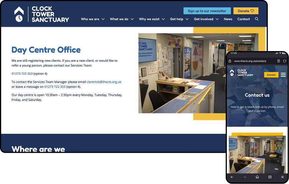
Upon initial investigation (Jan 2025), we identified opportunities to better align the Clock Tower Sanctuary website with the urgent, real-world needs of shelter seekers.
Whilst the platform contained valuable information, we spotted potential improvements around content organisation and emergency contact accessibility for times when the day-centre is closed. In contrast, we found that the donor user group had multiple clear access points, resulting in more efficient user pathways.
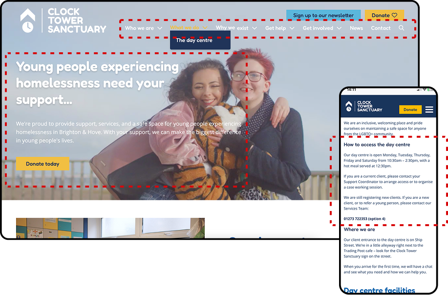
To enhance user experience and wayfinding, we identified several opportunities for the website.
Clearer visual indicators for interactive elements could help users immediately recognise what they can click or engage with. We also spotted a chance to strengthen the distinction between the "What We Do" and "Get Help" pages, making it even easier for users to find exactly what they're looking for. Finally, refining the content hierarchy could help users better understand how different sections relate to each other, creating a smoother journey through the site's information.
The Clock Tower Sanctuary's website demonstrated strong cohesive design and performed well, clearly reflecting their approach and commitment to their mission.
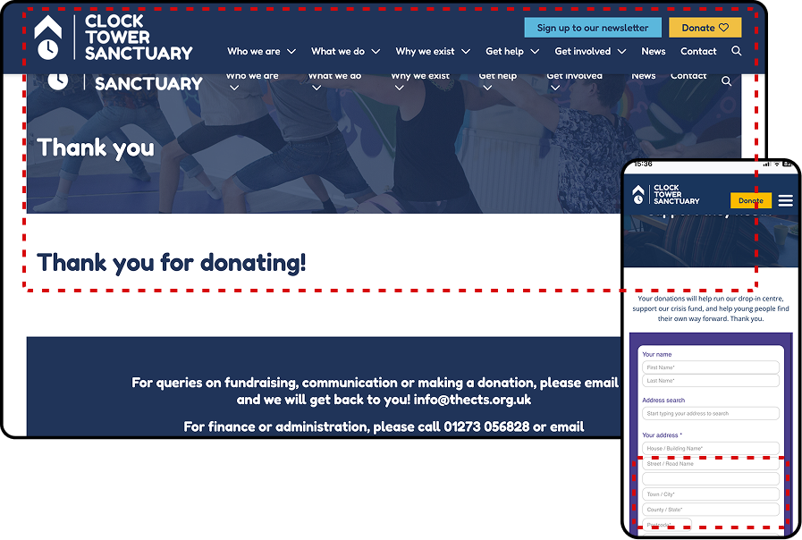
However, we were able to identify an opportunity to bring the same level of polish to the donation and post-donation experience. At the time of review, the input fields for donors spanned the full browser width on desktop with a smaller font size which presented a chance to enhance both accessibility and readability.
Refining this area would build on the Clock Tower Sanctuary's existing strong foundation and ensure the donation experience matches the clean and smooth experience throughout the rest of the site. This enhancement would reinforce donor confidence at this crucial moment and demonstrate attention to detail in supporting those who want to contribute to their important work.
There were some exciting opportunities to improve the Clock Tower Sanctuary’s website through accessibility and usability improvements, which could significantly expand its reach and effectiveness.
For example, enhancing contrast between text and background images would ensure content is more readable for all users, including those with visual considerations. Strengthening keyboard-only navigation would allow users who rely on assistive technologies to fully access all site features. Additionally, refining navigation elements and making clickable components more prominent would help all users move through the website more confidently and efficiently, potentially boosting both engagement and the support the Clock Tower Sanctuary receives from their vital donors.
During a UX Audit, it's easy to get bogged down highlighting all the areas for improvement—after all, why would you get your car serviced if everything was running smoothly? But it’s just as important to celebrate the wins!
Clock Tower Sanctuary demonstrated several strengths in their digital presence, such as their effective use of imagery, easily digestible content, and contact pages that provide convenient access to Google Maps for location finding. The charity reinforced the donor's experience through diverse donation tiers and compelling interviews with past clients, whilst validating the young people they help and encouraging them to seek necessary support.
Once our UX audits are complete, we don't just stop there. We go through our findings with our clients to open up the conversation and give them the opportunity to ask further questions about our process or findings. We also follow their journey and occasionally revisit their platforms to see them change for the better.
The same goes for Clock Tower Sanctuary, and after our initial investigation, we revisited the website revealing several positive changes, with previously identified navigation accessibility issues now resolved and the donation form experience significantly transformed and improved.
Their site now better serves their users by providing clear options for alternative accommodation and support services, which is particularly valuable when the day-centre is unavailable.
It's been a real privilege to collaborate with Clock Tower Sanctuary and to have helped enhance their digital presence for the vulnerable people at the heart of their mission as well as their virtual supporters.
-
Disclaimer: This UX audit research was based on evaluations and reflects findings and recommendations at the time of review.
We absolutely loved working with Clock Tower Sanctuary and want to say a big thank you to their team for trusting us to do this work and for being so receptive to our feedback and suggestions.
If you're a registered charity and are interested in a complimentary UX review of your digital product, please get in touch.

Let's see what we can make together.
From startups to scaleups and enterprise, we're always happy to talk to impact-focussed and ambitious organisations. Use our quote creator to get a better idea of scope, timescales and next steps.


